Candlestick Chart Guide: 14 Common Candlestick Patterns Explained
The candlestick chart is the basis of all technical analysis. Investors must understand the candlestick chart before entering the financial market. The candlestick chart is closely watched by traders because it is thought to give off long and short signals, allowing us to quickly judge the market conditions and investor sentiment.
Before explanation, we need to understand that the color of the candlestick chart has different expressions according to local customs. In the Greater China region or Japan, red is used to indicate price going down and green to indicate up, while in the international market, green means the momentum is positive and red means the momentum is negative. In other markets, the color pair of red and blue and red and black may be used. In this article, we will use red to represent price going up and green to represents price going down, to show you the structure of the candlestick chart and how to use candlestick patterns to determine the market momentum.
What is the candlestick chart?
The candlestick chart, also called the Japanese candlestick chart, can help us quickly determine possible price movements based on past patterns. Each candle represents all four important pieces of information: open and close in the candle body; high and low in the candlewick. In order to interpret the market situation in a day more quickly, if the closing price is higher than the opening price, the body is solid or filled in red (positive); if the closing price is lower than the opening price, the body is hollow or filled in green (negative).
Time frames setting
In theory, each candle can represent any time period, usually days or hours. The more often a time frame is used by investors, the more valuable the predictive role in the chart pattern, which means that the established trading strategy may be more stable. The time frame chosen is highly related to the buying and selling strategy or trading style of investors. The shortest unit is measured in “seconds” and the longest unit is measured in “months”.
Learn the common candlestick patterns
In candlestick chart analysis, each candlestick has its meaning. No matter the size of the body or the length of wicks, it can provide information for us to interpret the market momentum. No matter what time frame is used, it can show the current trader sentiment on a particular market. This article will introduce you to various candlestick pattens (with each candlestick representing a day).
(On the candlestick chart below, the red bar represents a price rise and the green bar represents a price fall.)
Five bullish candlestick patterns
During a downtrend, the candlestick pattern may signal to traders that future moves are likely to reverse at the bottom. This is also a good time for bulls to enter the market and profit from any upward trajectory.
1. Hammer
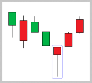
If a hammer forms in a downward trend, it means that after the opening of the day, there are some selling pressure, resulting in a sharp downward price, but the decline is not lasting. Because the price is supported by a strong buying force, the closing price will be slightly higher than the opening price, and the lower wick is 2 to 3 times as long as the body, and sometimes there will be a short upper wick. This means that the market likely hits the bottom and will rebound in the future, which is a bullish signal.
2. Inverse hammer
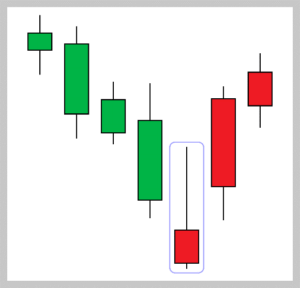
If an inverse hammer appears in a downward trend, it indicates that after the opening of the day, the buyers drove prices up at some point during the period in which the candle was formed, but encountered strong selling pressure which drove prices back down to close near to where they opened. The inverse hammer is usually taken to be a trend-reversal signal and traders should check for higher open and close in the next period.
3. Morning Star
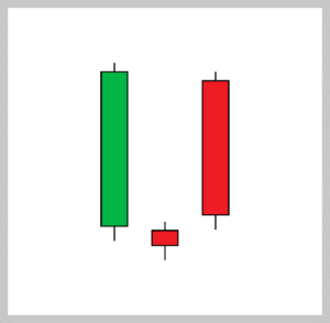
The morning star is composed of three candlesticks, which usually appear after a period of downward trend. The first one is a long-bodied green candle, indicating a strong short term bearish momentum. The second is a doji or spinning top with low opening price, indicating that the negative momentum has slowed down; The third is a long-bodied red candle with high opening price, showing that the long has regained the momentum. It signals that the selling pressure of the first day is subsiding, and a bull market is on the horizon.
4. Three soldiers (three white soldiers)
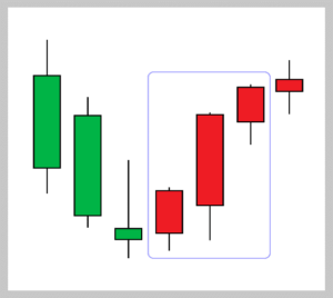
The three soldiers’ patterns are composed of three red candles. The closing price of each day is higher than that of each day, and each day’s closing price is the highest point or close to the highest point. If a three soldier pattern appears in a downtrend, it is a clear indication of a shift in power from sellers to buyers.
5. Bullish engulfing
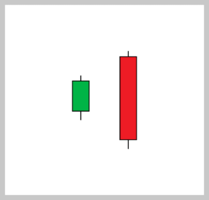
Bullish engulfing is composed of a short green candle with tail shadows, followed by a long-bodied red candle that completely engulfs the green candle. It means that the demand for buying drives the price up at the bottom and the market closes higher than it opened after a down day. A piercing line is a sign that a support level has been reached and the market will rebound.
Bearish candlestick patterns
During an uptrend, the candlestick pattern may signal to traders that future moves are likely to reverse at the top. This is also a good time for short sellers to enter the rally.
1. Hanging man
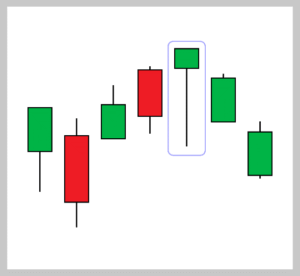
If a hanging man forms in an uptrend, it indicates that the bulls encounter a significant sell-off at the top, which makes the closing price is slightly lower than the opening price and leaves a long wick. The length of the lower wick is 2-3 times of the body, and sometimes a shorter upper wick will appear. The hanging man is often seen as an indication that the buyers have lost their strength and the bull market will reverse.
2. Shooting stars
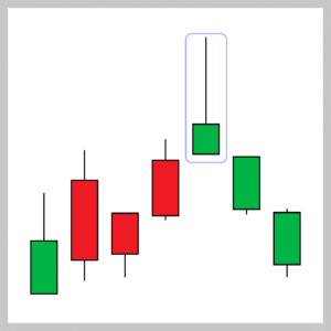
If a shooting star appears in an uptrend, it means that aftermarket gaps slightly higher on opening and rise strongly, the seller steps in and pushes prices back down for the period to close near to where they opened. The candle usually has a long upper wick, which is 2-3 times longer than its body, and sometimes a shorter lower wick may appear. A shooting star is interpreted as a type of reversal pattern presaging a falling price.
3. Evening Star
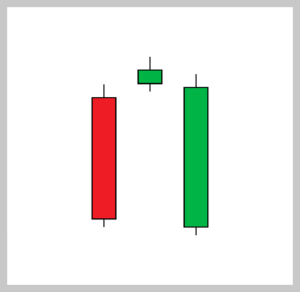
The evening star is composed of three candlesticks, which usually appear after a period of a rising trend. The first one is a long-bodied red candle, indicating a relatively strong positive momentum in the short term. The second is a doji or spinning top with a high opening price, indicating that the bullish power has slowed down; The third is a long-bodied green candle, showing that the balance has shifted to the bears. The evening Star indicates the rising trend is nearing its end and is about to reverse.
4. Three Green Soldiers (Three Crows)
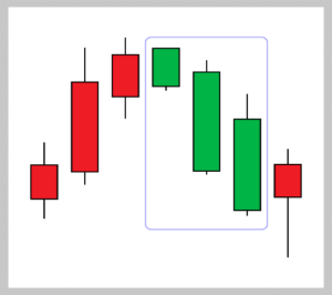
The three Green soldiers are composed of three green candles. The closing price of each candle is lower than the previous day is at or near the lowest point. If three crows appears in a rising trend, it signifies a bearish counterattack and is a sign of an impending market downturn.
5. Bearish engulfing
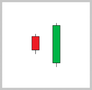
Bearish engulfing is composed of a small red candle with tail shadows, followed by a large green candle that completely engulfs the body of the green candle. It means that the market gaps higher on opening but a strong selling pressure has pulled down the price significant until closing. Bearish engulfing indicates the bullish market has come to an end and is likely to reverse in the following periods.
Continuation candlestick patterns
The following four candlestick patterns indicate the potential for a continuation of the market or the possibility of a change in the market, and traders should pay attention.
1. Doji
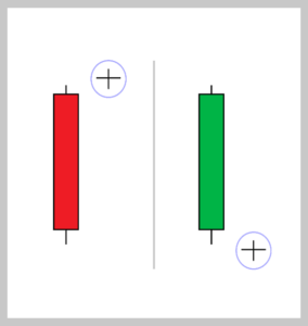
A Doji means that the candlestick has an equal or close opening price and closing price, and the longer the upper and lower wicks indicates an intense battle between the bears and bulls, and the future trend is unknown. The Doji may be a sign of trend continuation or a precursor of a trend reversal. If the Doji appears after the red candle, it means the positive momentum may be exhausted; If the Doji occurs after the green candle, it is a signal that sellers are losing conviction.
2. Spinning stop
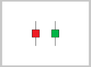
The candlestick pattern with long upper and lower wicks and short body is called a spinning top and is more commonly encountered in market consolidation. The candle body, whether red or green, is not very important but represents that neither side has an obvious advantage, and the future trend is unclear. If a spinning stop is formed in an uptrend, it means that the positive momentum is slowing down and the sellers may push the price down. On the other hand, if a spinning head is formed during a downtrend, it means that the bears are losing power, and there is a greater chance of a market rebound.
3. Rising three methods
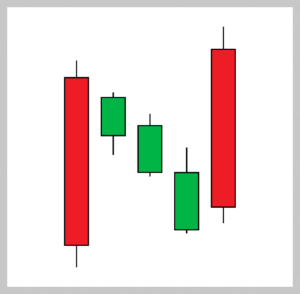
Rising three methods is composed of a long red candle, followed by three shorter candles (can be red or green, but mostly green), which are confined within the range of the first bullish candle (including the shadows). The pattern is ended with a long red candle that closes above the high of the pattern, which means the market will go up in the future and the rally will continue.
4. Falling three methods
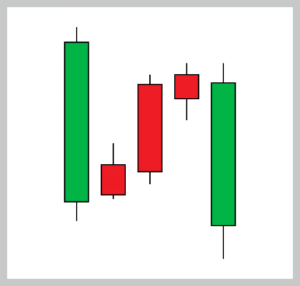
Falling three methods is formed of a long red candle, followed by three smaller candles bodies (can be red or green, but mostly red), and another long red candle, with a closing price lower than the closing price of the first red candle– the green candles are all contained within the range of the bearish candles. It shows traders that the bears, despite the buying pressure, are retaining control of the market.
The above candlestick patterns are only some of the more widely known and considered by investors to be of high predictive power. There are also some less popular candlestick patterns which may have different names for investors’ reference.
The application of a candlestick chart can further strengthen the trading strategy of investors if it can be used in combination with the technical indicators of other transactions and the judgment of the whole trend pattern.
More Technical Analysis Strategies:
Day Trading Strategies: 3 Ways to Spot Trading Signals
Granville’s 8 Rules for Moving Average (MA) | Forex Indicators Tutorial
——
About ZFX (Zeal Capital Market)
- The Best Trading Platform Award 2019 from Financial Weekly, Regulated by FCA & FSA.
- 100+ trading assets, including Forex, Stocks, Indices, Gold, Crude Oil, etc.
- 3 types of trading accounts to meet the needs of every customer
- 0 commission, low spread, leverage ratio up to 1:2000
- Powerful trading platform that executes 50,000 orders/s
- Open an account with a minimum deposit of $50
- 24-hour Customer Service
——
Risk Warning: The above content is for reference only and does not represent ZFX’s position. ZFX does not assume any form of loss caused by any trading operations conducted in accordance with this article. Please be firm in your thinking and do the corresponding risk control.